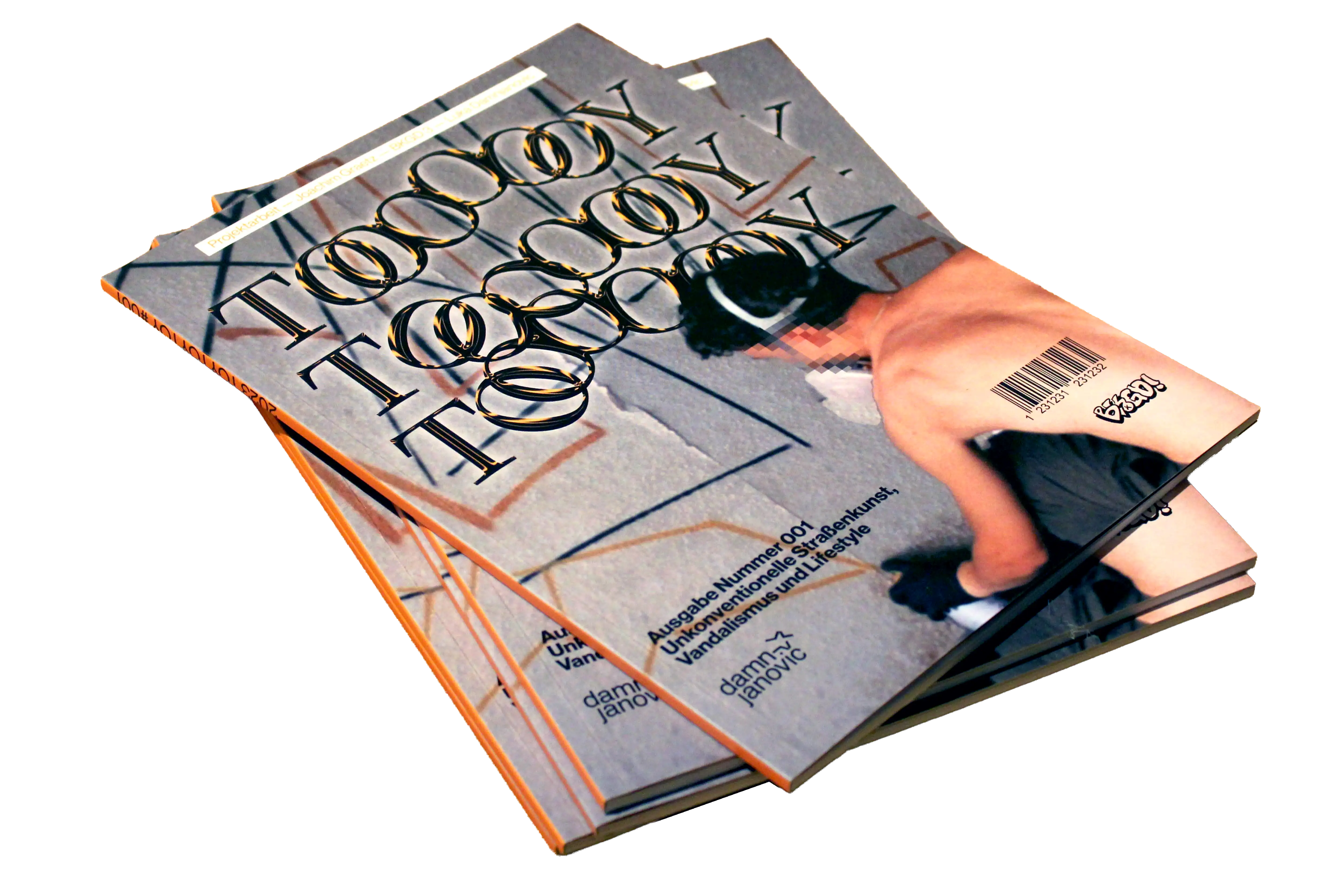
toytoytoy
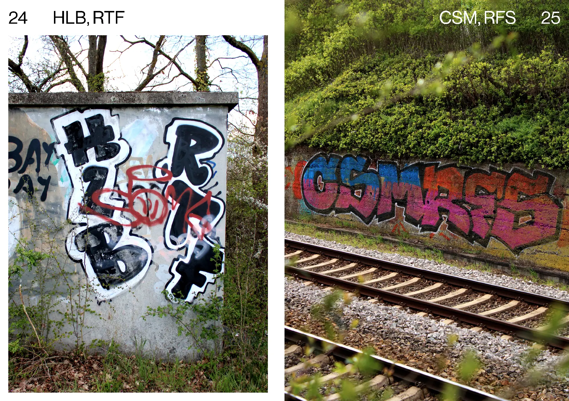
Although not originally planned, this project evolved into a very personal one during its creation. I was born in Sindelfingen in 2000. In the decade that followed, the local graffiti scene flourished, with new artworks appearing daily on the city's facades. These images inspired me early on, and the sprayed letters embedded themselves into my subconscious from a young age. I was constantly on the lookout for new graffiti. However, by the time I became a young adult, the scene had almost died out, and so I remained an external admirer. My favorite pieces still stood firmly on the house walls, but they seemed to fade more each day.
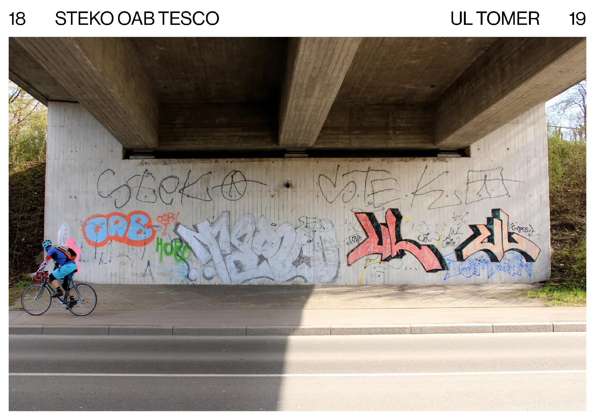
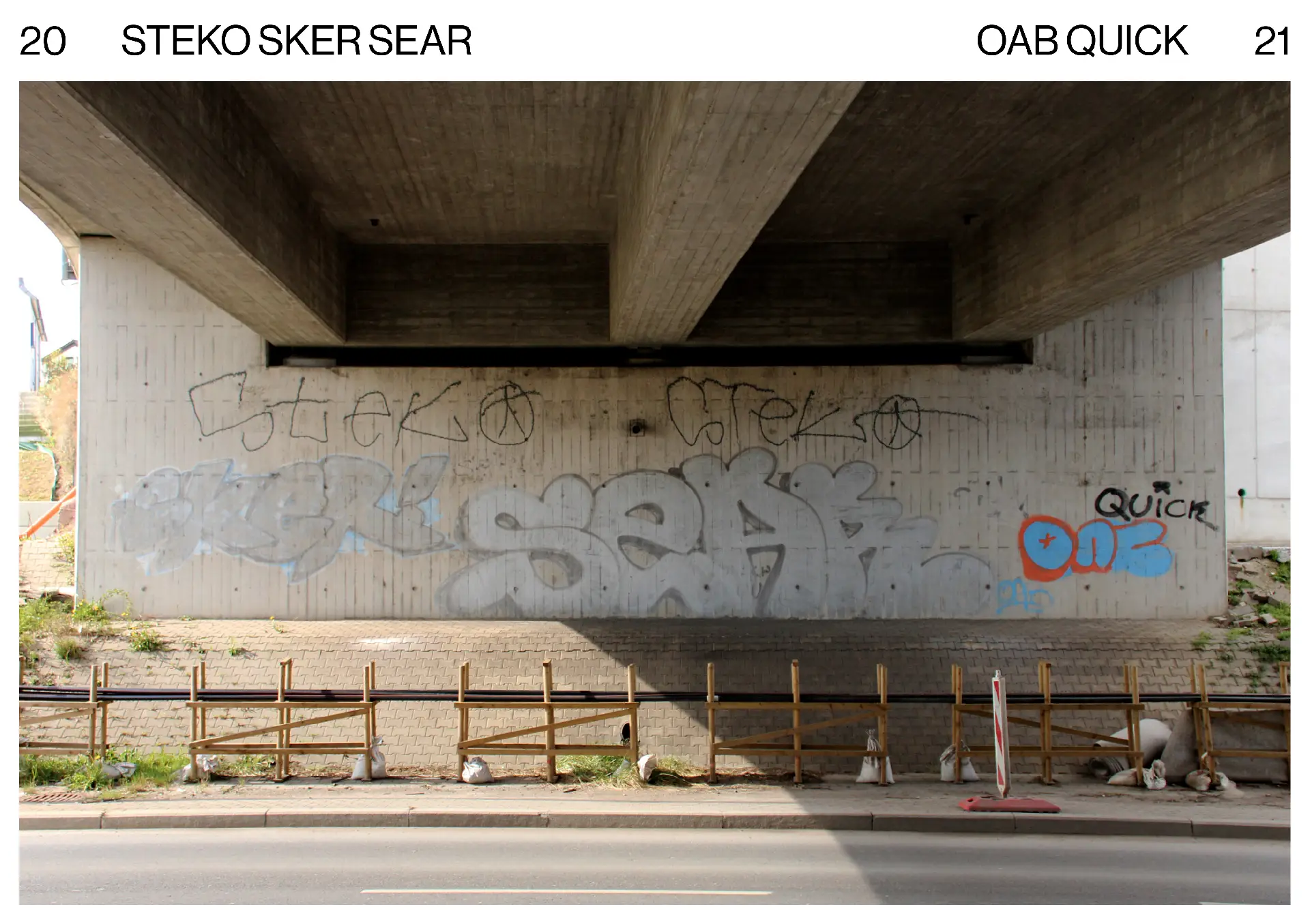
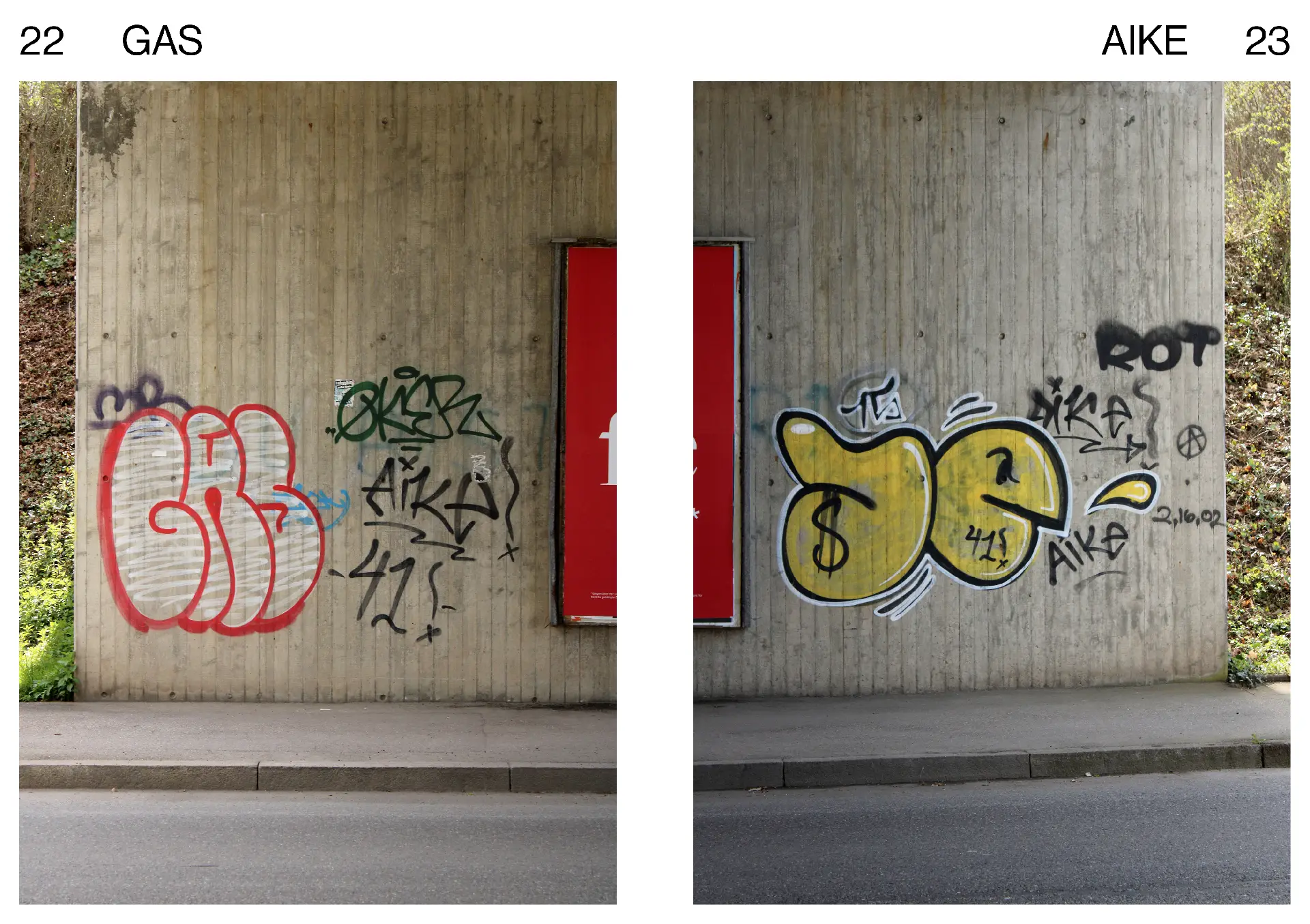
When I began my graphic design training some years later, I had almost forgotten my passion for graffiti. But suddenly, it was all about letter construction, type composition, and the psychology of colors. Old memories flooded back, and the graffiti I used to see every day on my way to school reappeared in my mind's eye. I was just as aware that the stroke of the letter 'K' originates from the arm and not the baseline, as I was that lighter colors require less area to have the same visual weight as darker ones. Meanwhile, typography and typeface design has become one of my favorite disciplines in design, and I believe my ten-year-younger self would be thrilled if I could tell him that. In the first section, "Excerpts from the Archive," many of these old graffiti pieces are visible. For me, this part is a kind of tribute to the sprayers who, unknowingly, turned a little guy into a designer over a decade ago.
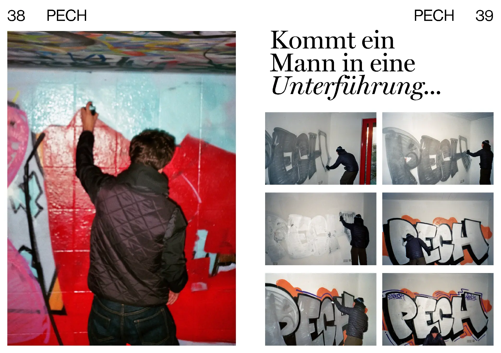
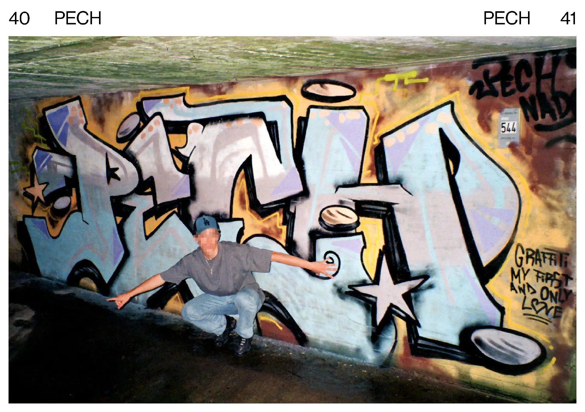
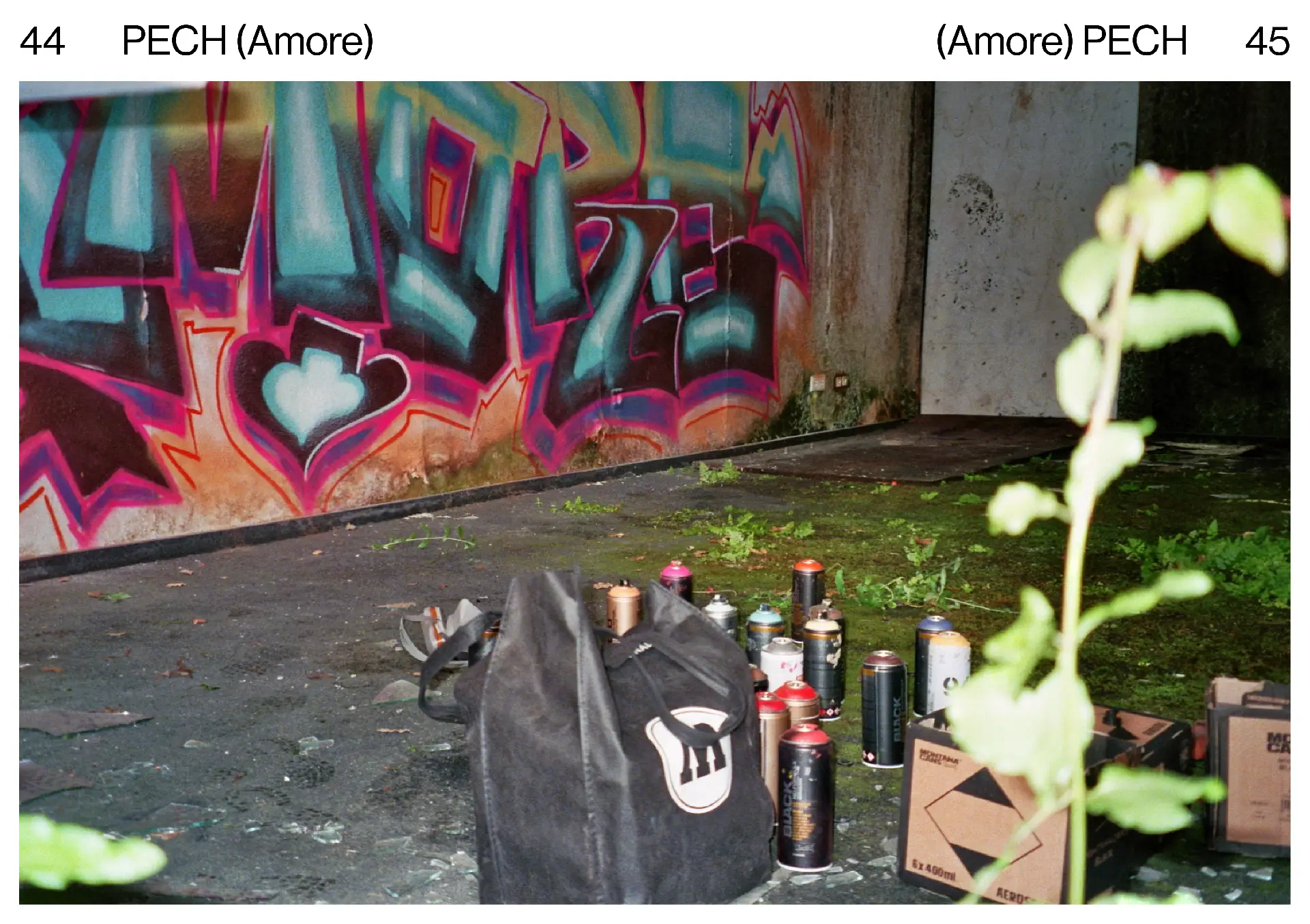
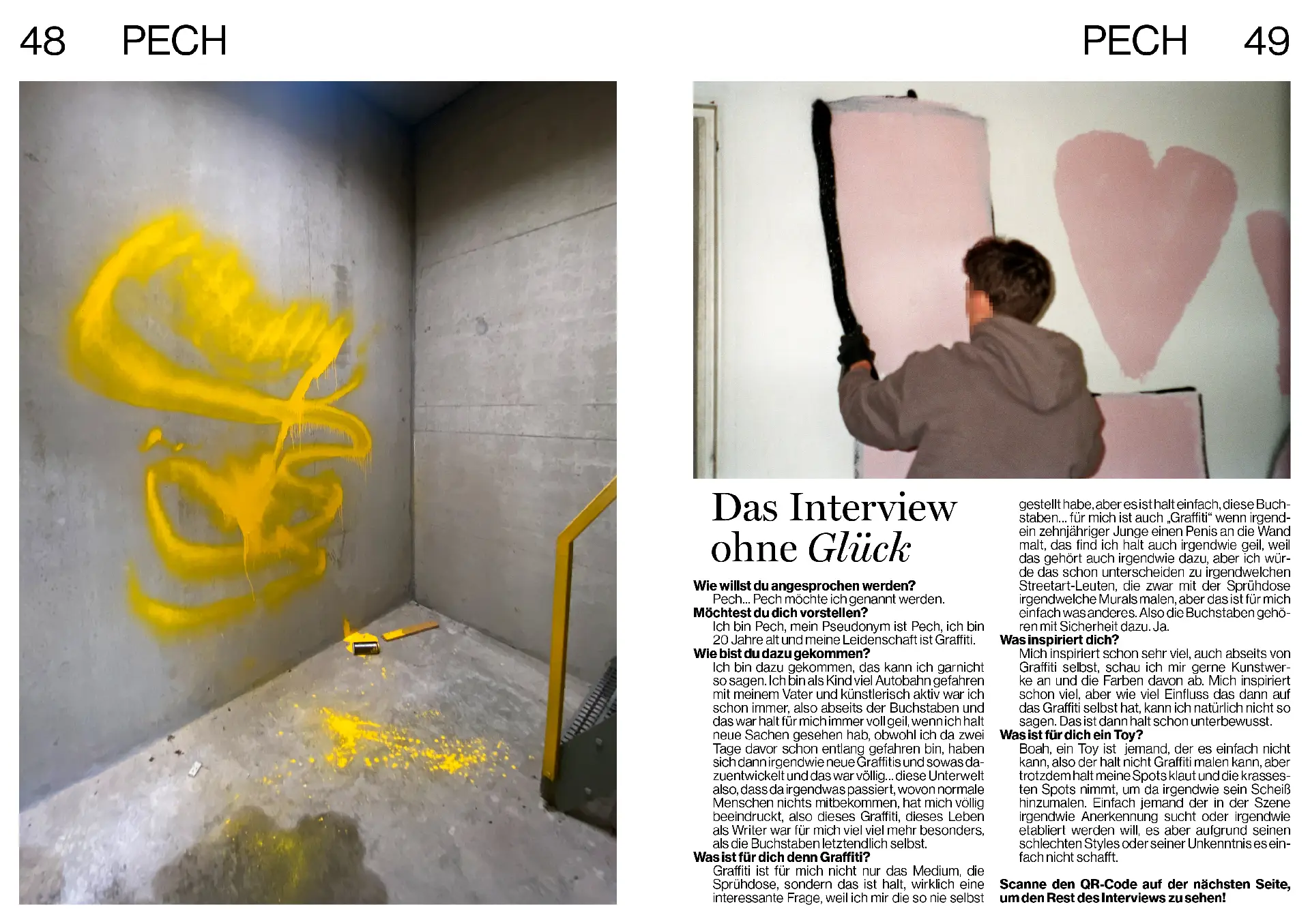
The second part of the work consists of an engagement with a contemporary graffiti artist. I accompanied him during his work, documented the process, and conducted an interview. This interview is part of the magazine, but its full length only appears in the film, which is intended as a companion medium to the magazine. In the film, you also see the artist working on an exclusive commission for the magazine.
